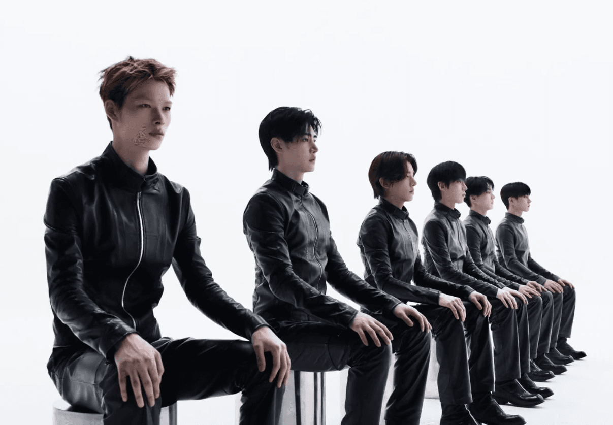
ENHYPEN has officially entered a new chapter with the unveiling of a brand-new logo and identity, as HYBE begins showcasing the updated branding at its headquarters.
The group's new logo and official brand description have been displayed on the HYBE building, confirming that the rebrand is now fully underway. The updated visual identity represents ENHYPEN's continued growth and evolving artistic direction.
Meaning Behind ENHYPEN's New Brand Identity
According to the newly released description, “connection” remains the core of ENHYPEN's identity. It explains that the members have grown into one unified team through their diverse backgrounds and shared experiences, while their music continues to connect people, ideas, and worlds.
The description further compares these connections to points forming lines, lines creating planes, and planes expanding into multidimensional structures. Rather than remaining fixed, these relationships continuously grow and evolve, symbolizing ENHYPEN's ever-expanding universe.
New Logo Symbolizes Growth Together
The new logo animation features a domino effect, representing how each member influences and supports one another. It reflects the group's philosophy that every connection leads to new possibilities, creating continuous growth as one team.
HYBE has already begun replacing ENHYPEN's previous logo throughout its headquarters, signaling the official start of the group's new era. Fans have praised the refreshed design and are eagerly anticipating what lies ahead under ENHYPEN's renewed brand identity.